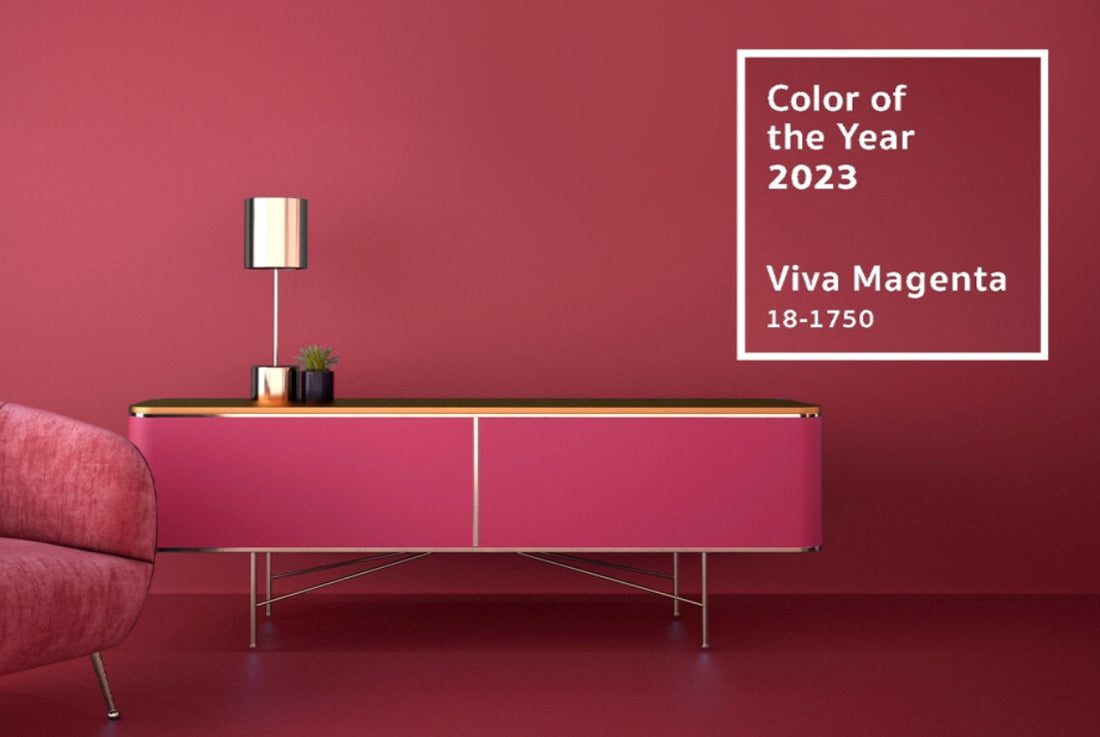
Meet this year's Pantone Colour of the Year 'Viva Magenta'


Our first step to pulling together a design scheme or mood board is always starting with some artwork. There is no easier way to inject some colour into your walls or space by prints or a canvas. Take a look at our Pink Flamingo Canvas for example. Made from the purest of shades to capture the majestic beauty of the American pink flamingo. This framed masterpiece is a work of art that will bring some serenity into your home. Adding this pop of the Pantone Viva Magenta, while having the slight pale blue tones is the perfect start to pulling together a design scheme as your colour palette has already started to grow.

Another way of adding pops of colour throughout your home is with soft furnishings and accessories. This could be anything from some scatter cushions right through to a funky feature table lamp. Here at Cotterell & Co, we have everything to help you achieve this. Mixing and matching these decorative cushions requires a little bit of know-how to get them looking just right. Not only does the perfectly placed cushion make your sofa look cosy and inviting, but it is also a very cost-effective way of refreshing a space by adding a mixture of materials and colours. Starting with our Persian rug-inspired cushion, which features mostly bold pink, with touches of green and blue. Perfectly toning in with the Flamingo Canvas, but adding another rustic feel to this design scheme. The key to success when adding cushions with such a bold pattern, is balancing them out with some plain scatter cushions which tie in. Our bellini cushion range is perfect for doing this. The Bellini teal is a perfect example of a plain scatter cushion to tie this together. Don’t be afraid to combine multiple textures from velvet to silk to fur. Combining lots of different textures will help to add depth to your home while keeping it cosy.
Lighting is another important aspect of design when thinking about how space affects our mood. Light and mood are two different concepts that have a very powerful connection with each other. We mostly use our homes at night, where in the winter months it can get very dark. Both bright lights and dim lights can negatively affect our mood. Bright lighting in dining spaces can decrease appetite whereas dim lighting can overly encourage overeating. This is why it is so important to get lighting just right. When we are active, we need plenty of bright task lighting but when we are chilling out and relaxing, it is all about the mood lighting. You can create this by using table lamps and floor lamps throughout the space, avoiding anything overly bright. Our bespoke shade service is a great way to add more colour and pattern to a space while still helping to create that mood lighting. Check out our mood board we pulled together using the Flamingo Canvas as the basis of the design scheme.

1. Humbug Table Lamp with Fuchsia Pink Shade
2. Jaffa Orange Shade with Fluffy Rainbow Inner
3. Can Can Flamingo Table Lamp
6. Purple Wildflower Spray Flower
Starting by pulling out the orange tones within the Persian-inspired cushion, we decided to add some more pops of colour with our Lucca Tobacco Velvet Chair. Working perfectly with the plain bellini teal cushion behind. Carrying on from this, we felt our fluffy rainbow shade with Jaffa orange outer toned in as we were building up the scheme. Our Fluffy Rainbow fabric, features a natural linen background, with orange, pink, blue and yellow fluffy fragments. To bring in more of this year's Pantone colour, we choose to add in our very popular humbug table lamp, paired with a very on-trend fuchsia pink shade. We have a huge range of fabrics, accessories, lighting, furniture and much more, perfect for when you are looking to inject some colour into your home. Now is the time to jazz up your home in this year's colour of the year.

I hope you have enjoyed reading our little blog about this year's Pantone Colour of the Year and how we at Cotterell & Co could help you add some pops of colour to your home. Hopefully, we have inspired you to be bold and brave when it comes to designing. Remember, we have a well-trained team of Interior Designers here who are just raring to go ready to help you turn your house into a home. We are all happy to help with anything as simple as picking a paint colour, all the way to designing your full house. Don’t hesitate to contact us via Email, Direct Message, WhatsApp or simply just give us a call!
