
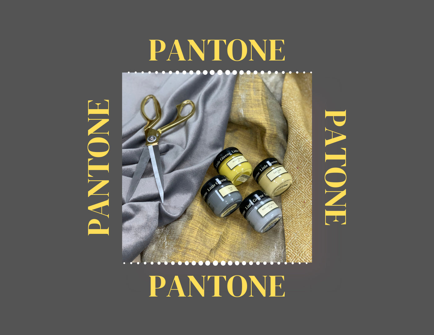
It is always a very exciting time of year when Pantone release their predicted Colour trends of the new year. This year we have seen a twist on the selection where it wasn’t only one colour chosen. Pantone decided upon two colours for 2021's Pantone Colour of the Year. Ultimate Gray 17-5104 + Illuminating 13-0647, two independent colours that highlight how different elements come together to support one another. This is definitely a recurring trend. We have seen the mustard and grey trend take homes and interiors by storm before, and here it comes back around again, stronger than ever. Pantone’s thought process behind the colour choice this year was a very uplifting and happy thought.

The Union of an enduring Ultimate Gray with the vibrant Yellow Illuminating, expresses a message of positivity supported by fortitude. Practical and rock solid but at the same time warming and optimistic, this is a colour combination that gives us resilience and hope. We need to feel encouraged and uplifted; this is essential to the human spirit. As people look for ways to fortify themselves with energy, clarity, and hope to overcome the continuing uncertainty, spirited and emboldening shades satisfy our quest for vitality. PANTONE 13-0647 Illuminating is a bright and cheerful yellow sparkling with vivacity, a warming yellow shade imbued with solar power. PANTONE 17-5104 Ultimate Gray is emblematic of solid and dependable elements which are everlasting and provide a firm foundation. The colours of pebbles on the beach and natural elements whose weathered appearance highlights an ability to stand the test of time, Ultimate Gray quietly assures, encouraging feelings of composure, steadiness and resilience.


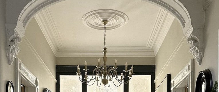
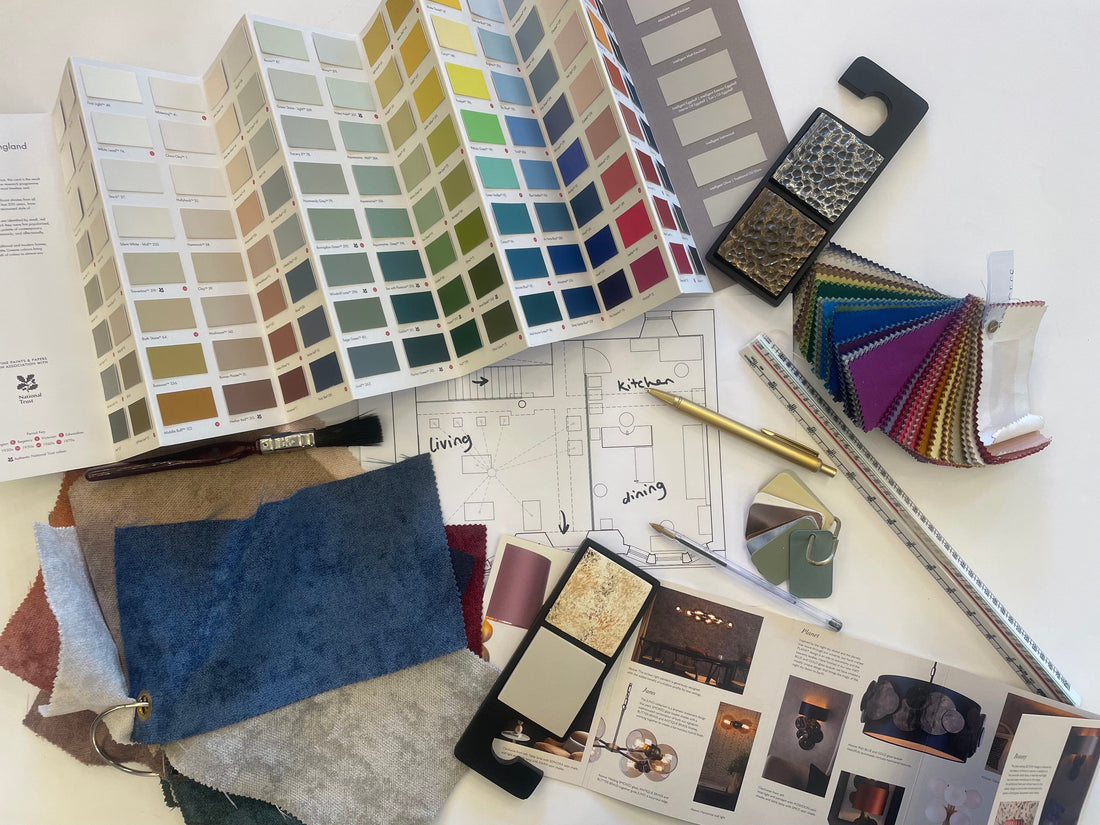
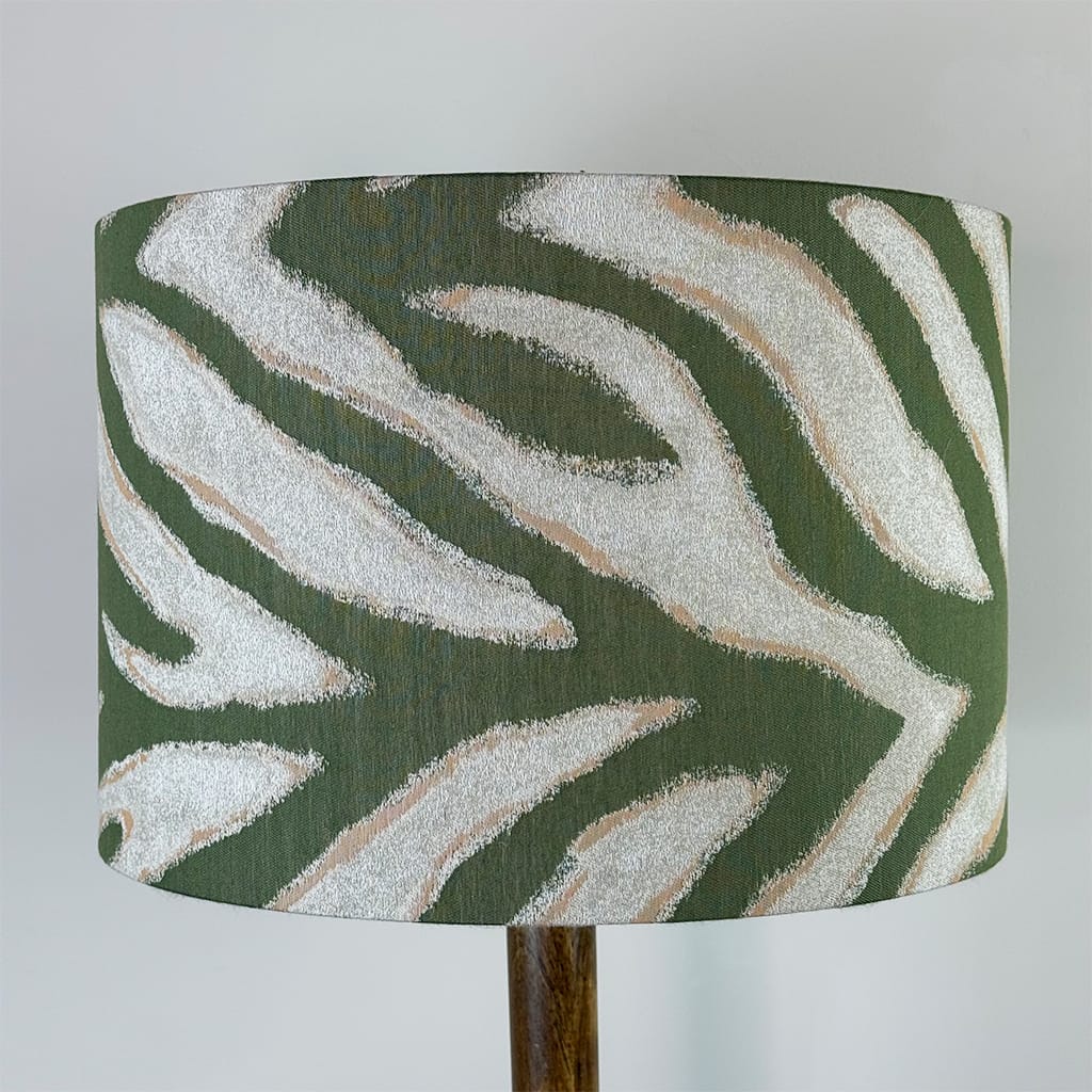
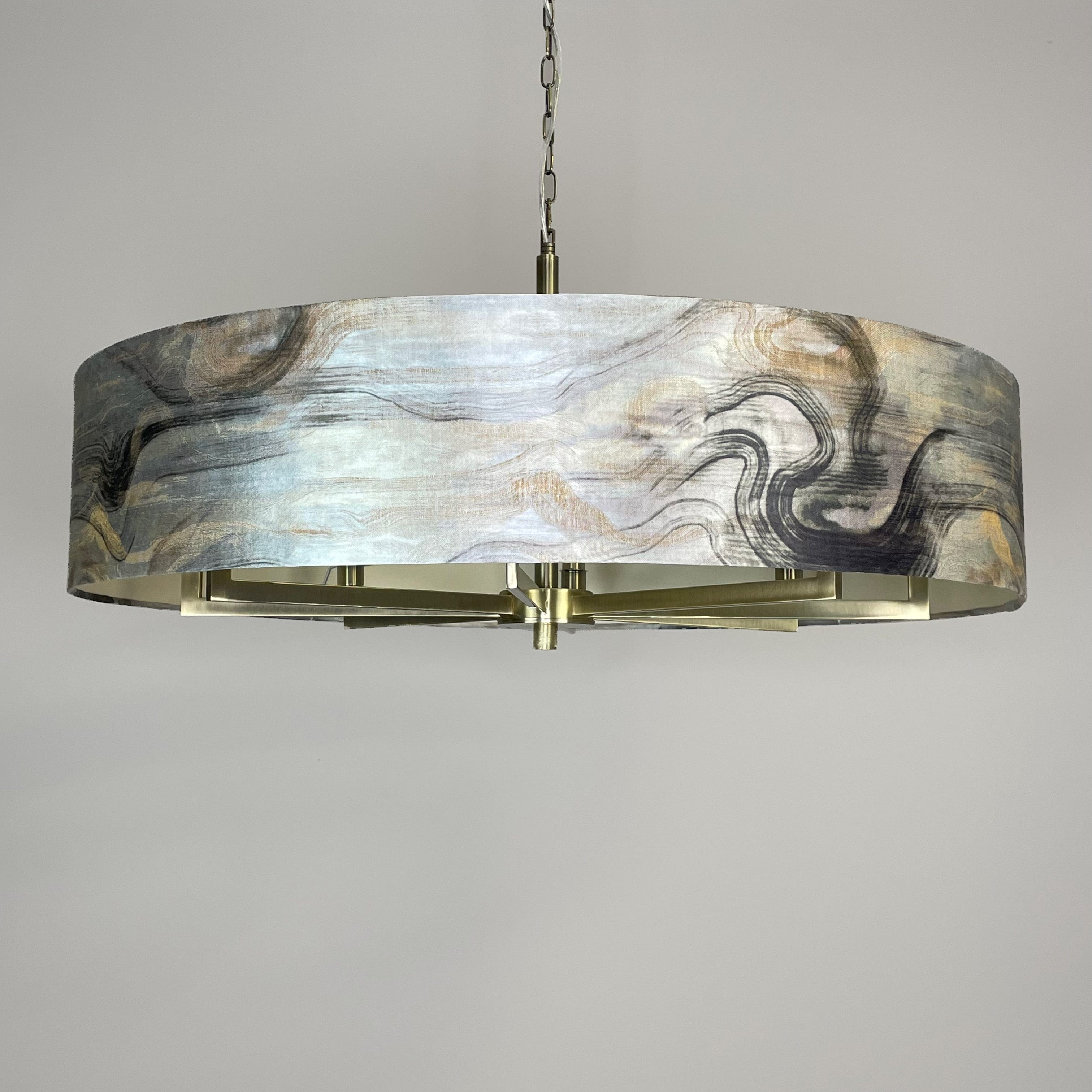
Putting together mood boards like this, is a great service we can offer to help customers visualize and see how colours and textures all look together. It would never be a finished mood board without a small selection of Little Greene Colour choices. One of my personal favourite ways to add colour to a room, is by a feature wall or some feature paint. My personal favourite way of adding a feature colour is a fabulous way if you might not want too much of the one colour but still want to make a dramatic impact.


Little Greene have also recently brought out the most impressive primer. This primer allows you to paint on just about any surface. This is perfect for all those people out there, who love to renovate and upcycle furniture you might already have lying around. I see this piece of upcycled furniture and I just couldn’t not include it. Again, using the perfect combination of yellow and different shades of grey, this person has used a unique design by using wallpaper on the side of the cabinet, then taken each shade from the wallpaper to paint the rest of the furniture. Adding feature animal handles to finish this piece off. What a fabulous way to change an old piece of furniture you might have lying around as well as turning it into a bold bright talking point for any guests you have. Absolutely stunning!


We hope this blog post has helped to inspire you to jump on trend with this year’s 2021 trend of Yellow and Grey. Don’t forget we are always here to help with designing shades, picking paint, picking cushions and light specifications. Don’t hesitate to contact via Email, Direct Message and Calling us and we will be happy to help!