
Colour Your Home with Cotterell & Co Confidence
Summer is the season of light, warmth, and playful experimentation - especially in your home. With brighter days and more time spent entertaining, relaxing, or refreshing your space, it’s the perfect opportunity to embrace bold, expressive colour. In 2025, vibrant hues and nature-inspired tones continue to take centre stage, helping us move away from safe neutrals and toward personal, joy-filled interiors.
In this month’s blog, we’re spotlighting our team’s favourite Little Greene colours and how you can use them to transform your home this summer. From energising oranges to cooling greens and grounding neutrals, discover inspiration, moodboards and curated Cotterell & Co products to bring your colourful vision to life.
Little Greene is an independent, British paint and wallpaper manufacturer with a rich heritage of craftsmanship and design. Known for their commitment to quality and sustainability, they offer a beautiful palette of over 200 carefully curated paint colours, including heritage shades drawn from the National Trust archives and bold contemporary tones. Each colour is deeply pigmented for exceptional depth and coverage, suitable for both modern and traditional interiors. With eco-friendly formulas and a timeless aesthetic, Little Greene is a go-to for designers and homeowners alike who want to bring authentic colour and elegance into their homes.
Dramatic Hallways: Welcoming Hallways in Adventurer
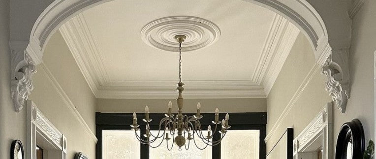
First impressions matter, and a bold hallway sets the tone for the rest of your home. This often-overlooked space is the perfect spot to experiment with deep, dramatic colour.
Staff Pick: Ruth, in our Glasgow branch, loves Adventurer
This earthy plum-aubergine hue creates a warm, sun-baked welcome that’s perfect for summer. Adventurer brings instant character to transitional spaces like hallways -especially when paired with soft lighting, antique brass, and woven textures.
Summer Style Tip: Add an oversized mirror to bounce light around and a runner rug in terracotta or natural jute to tie it together.

We love the bold use of this tone in the unique entranceway below by @g_decoration.
What we would choose:

Keleti 4 Light Matt Antique Brass Semi Flush Ceiling Light

Gold Metal Starburst Round Wall Mirror

Labyrinth Curved Rug in Ochre
Confident Kitchens: Cook in Colour in Mid Azure Green
Gone are the days of safe white kitchens. 2025 welcomes rich hues and colourful cabinetry for a more dynamic and inviting cooking space.
Staff Pick: Niall, in our Edinburgh branch, chose Mid Azure Green as his favourite
A vibrant, deep teal-green that is Cool, fresh, and just the right amount of vibrant. Mid Azure Green channels summer coastal vibes into the kitchen. Whether on cabinets or walls, this shade sings alongside sunlit woods, gold details, and open shelving.
Summer Style tip: Contrast with crisp white tiles, warm woods, and gold hardware for a modern touch. Add potted herbs, seagrass baskets, and crisp white accessories to complete you Mediterranean-inspired kitchen.

We’re raving about this Manor House kitchen designed by Chiselwood Kitchens in Lincoln – see @chiselwood_kitchens
What we would choose:

Zeta Gold Wall Light

Grey Kubu Storage Basket

Large White Urchin Jug
Bold Summer Bathrooms: Retreat to Sage Green
Bold doesn’t have to mean loud. Deep tones can be incredibly calming in a bathroom when styled with care.
Staff Pick: Kelsey, on our digital team, is obsessed with Sage Green since using it in her bathroom last Summer
A soft, muted and charming green with a restful feel - ideal for winding down with its desaturated feel. The grounding tones in Sage Green brings spa-like serenity to bathrooms, it’s especially striking in the morning light and pairs beautifully with rattan accessories, stone neutrals, and fresh greenery.
Summer Style tip: Paint all walls from floor to ceiling for a serene cocooning effect. Layer in linens or rattan, softer lighting, and soft wood tones such as a bamboo stool for wellness resort energy. Plenty of greenery in a space goes well for a natural feel or pair with stone-based colours such a Portland Stone as a modern neutral.

The image is taken from Little Greene (but Kelsey wishes it was her bathroom!)
What we would choose:

Caswell Natural Rattan Cloche Pendant

Khao Light Grey Wood 2 Door Shelf Unit

Medium Olive Tree in Pot
Joyful Living Rooms: Lighten the Mood with Tea with Florence
Living rooms are meant to be lived in, and colour can help you strike the perfect balance between comfort and impact.
Staff Pick: Chris, in our Edinburgh branch, picked Tea With Florence as one of many favourites
A vibrant blue-green with warmth and cheer, Tea With Florence is perfect for social living rooms in summer. It’s softer than Mid Azure Green but equally expressive -ideal for long, lazy evenings and colourful company.
Summer Style tip: Use on a feature wall or built-in shelving and balance with white trims and leafy plants. Pair with light wood furniture and breezy textiles for summer lounging.

We love to see Tea with Florence as an accent wall, just like in our Glasgow Store!
What we would choose:

Bronte Jade Pendant with Seri Mineral Wallpaper Lining

White Wood Effect Floor Lamp with Shade

Edlyn Blue Green Ceramic Table Lamp with Ocean Blue Ikat Tapered Shade
Energising Corners: Reading Nooks brightened with Heat
Smaller zones in your home are perfect for bursts of unexpected colour and creativity.
Staff Pick: Heat
There was a unanimous vote on which paint colour attracts the attention of our customers the most. Heat. If summer were a paint, it would be Heat - an optimistic orange that energises any space. Whether in a reading nook, office alcove or sunny hallway, this vibrant colour adds a joyful punch. Highly pigmented and super sophisticated in an urban scheme, Heat really shines.
Summer Style Tip: Use sparingly but confidently - on an accent wall or corner with a bold rug and playful lighting or shade, Heat can make the smallest space shine.

Heat is bold so be as bold as you like! If a little goes a long way for you, you can see this creative way Heat has been paired in this reading nook by Little Greene, showing how a small dose can make a big impact.
What we would choose:

Mizia Velvet Medium Orange Pendant

Fife Hammered Metal Wall Light in Copper

Op Art Cushion
Light & Airy Neutrals: Unwind with Hammock
Sometimes bold design is all about balance. A well-chosen neutral can provide the perfect backdrop for more vibrant accents.
Team Favourite Neutral: Hammock
Airy, versatile and quietly elegant, Hammock is our go-to summer neutral. It softens any room while letting your bolder pieces shine. This unbleached tone feels natural and effortless - like linen curtains swaying in a breeze.
Summer Style Tip: Pair with woven textures, coastal blues, and plenty of glass or pale woods. Ideal for relaxed, open-plan living and sunny garden rooms.

Hammock is versatile and can be used in many places but we love this outdoor living space complemented with crisp fresh whites and floral arrangements to give a Mediterranean retreat vibe.
What we would choose:

Pocita Rattan Large Shade

Patio Beige Stripe Rug

Quinn Natural Beech Wood & Natural Paper Rope Chair
Powder Rooms with Personality: Go Bold with Hellabore
Small spaces like downstairs toilets and cloakrooms are ideal for going bold. Have fun with colour and pattern here.
The Wild Card: Hellebore
We love to throw in a wild card in all design processes, you never know how it will be received but Hellebore is by far our favourite out-there colour. This colour is a sultry, sophisticated dusky pink with violet undertones. Drench your powder room in it and top it off with wallpaper on the ceiling, a dramatic mirror and some opal lighting.
Summer Style Tip: Gold or aged bronze lighting elevates this pink to a luxe level.. A lot of our David Hunt lighting would pair perfectly.

We adore how Little Greene showcased this powerful palette.
What we would choose:

David Hunt Pop Bathroom Wall Light in Blush Pink

Skovgaard Rectangle Mirror with Gold Detail
White & Gold Set of 2 Planters
Summer is the Season to Play with Colour
Let light and colour in this summer. Whether you're revamping a hallway, creating a bold bathroom, or refreshing a peaceful bedroom, Little Greene’s colours offer inspiration for every mood and space. At Cotterell & Co, we’re here to help you choose the perfect shade - and pair it with lighting, décor, and bespoke lampshades to match.
Pop into one of our showrooms or shop online to discover our full range of bold lighting, bespoke lampshades, and Little Greene paint favourites. Need help choosing the perfect palette? Our interior experts are here to help. Little Greene samples and swatchbooks are also available in store!
Stay Inspired
Love what you see? Follow us on Instagram, Facebook, and Pinterest @cotterellandco for daily design inspiration, behind-the-scenes looks, new product launches, and styling tips from our team. Share your projects with us using #CotterellAndCo - we’d love to see how you’re using Little Greene colour in your home!